Eva Sperner-Zernickel is an expert in design with flat glass, having created many public and private works for architectural sites througout Germany.
She has studied internationally at the Glass School in Pilchuck (Washingon, USA), and also in Tokyo, Kyoto and Osaka, Japan.
Her methods include use of white floatglass, painting color onto melting glass, acid etching, engraving and sandblasting.
This project will be her first to integerate glass mosaic with certamic elements.
You can email Eva Sperner-Zernickel at eva@claycolorfire.org
Links
Eva Sperner-Zernickel's web site (www.sperner-glas.de)
http://www.marktplatz-achental.de/sperner/architektur.htm
Text from Slide Lecture, July 12, 2003
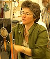
I'm Eva Sperner-Zernickel from Munich, and I'm very happy to take part in this wonderful Clay, Color and Fire project. Let me bring to you many greetings from our sister city of Munich, especially our cultural adviser Mrs. Professor Hartl.
It may be surprising that I am a glass artist working in a clay project. I hope that I can enrich this mosaic project through my experimental use of glass while integrating it with ceramic tile.
Eva Sperner-Zernickel's Technical Notes
My design was enlarged to the full size. Make a note at this time that extra space will occur between tiles where the design meets itself when wrapped on the column, due to the thickness of the mortar bed applied to the column. Better to make your left and right side tiles a little wider that first drawn to make up the gap which can be 1/4" - 1".
Next we retraced our designs on tracing paper, giving every mosaic tile a number. These numbered maps allowed us to return each piece to its place after firing. Already in this stage there must be a definite design plan for the grouting lines. They become an important part of your design in installation.
We used slab rollers to insure that the clay would be prepared with a specific thickness. Wooden boards sealed in plastic and covered with canvas slip sheets allowed us to move the slabs with minimum bending, thus discouraging warping in drying. My column size was 12" in diameter, half the width of the other artists' columns. My tiles could not be more than 1" wide. The 11 % shrinkage of the clay created perfect spaces for grouting.
The whole clay slab was assembled from more than a dozen smaller slabs. The large slab was kept moist with spraying and a plastic cover until I could transfer my design. With a thin wooden tool I traced each line into the soft clay. Only with wooden tool, my fingers and a sponge I modeled the relief. It was a "self-forgetting" dance!
One important challenge for me was the workshop electric light fixtures. With light coming from above, the relief carving did not create the shadows it would when installed at the pavilion site. Another decision had to be for more or less relief on the surface, anticipating the "opening" of the clay surface by each necessary grout joint. We also had to be conscious of the limitations of time and clean-up of the grouting process, and create a surface that would not be impossible for the tile setters to finish. Textures are most attractive when there is a contrast between smooth surface and textures.
The color was sprayed by airbrush to create a smooth transition from green to blue. To maintain areas in the original clay surface I made paper masks in the shape of the clouds. By spraying the masks with water they stuck to the wet clay, allowing for a clean line. To intensify the color, I added by spraying to the top and to the bottom of the column a mixture of 1 unit pigment to 3-4 units of water, being careful so not to make the color too intense.
The sprayed slip rested over night, carefully covered with plastic. Next morning some lines were corrected and emphasized by engraving. When leather dry, the tiles were cut first vertically with a large pizza cutter and straightedge. Airbrushed surfaces are very delicate, and you cannot correct them. You can see every point of pressure in the calm surface.
Many volunteers helped as we carved a number into the back of each tile and transferred them in order onto boards. To dry tiles evenly and without warping, we daily changed the newspapers underneath and cotton clothes on top, leaving the boards lightly covered with plastic. After 3 days, we transfered the clay tiles on kiln shelves for firing. After firing we rearrange the tiles onto fiberglass mesh which was laid on top of a plastic sheet which overlaid the enlarged original drawing. Then each tile was attached to the mesh with a spot of Weldbond glue.
Thanks for the help of everyone on every level!
| Previous | Back to Clay Color & Fire | Next |